
Qogita
- Client
- Qogita
- Role
- Lead Product Designer
- Timeline
- 2 years
- Deliverables
- Buyer & checkout experience, Design system, Frontend collaboration
- First-time checkout completion
- +18%
- Average monthly repeat orders
- 2.2×
- GMV during tenure
- €31M
- Reported buyer confusion
- −50%
Qogita is Europe's largest B2B wholesale marketplace for health and beauty — over 500,000 SKUs across 300 distributors, with orders between €1K and €100K and around 20% month-over-month growth. An algorithmic checkout was its competitive edge and its biggest UX liability. I owned the buyer and checkout experience for two years, and led three phased releases that turned the black box into a workflow buyers could see, understand, and act on.
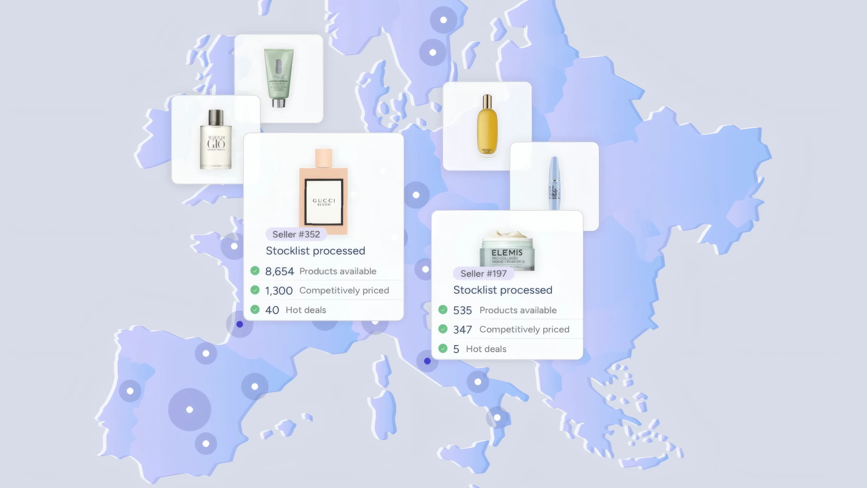
Two buyers, one black box
An AI allocation engine matched every cart to an optimal mix of suppliers across 300+ catalogs. The network was Qogita's edge; the allocation was buyers' biggest frustration. Early Qogita behaved like a high-autonomy buying agent that silently decided almost everything on the buyer's behalf.
What the buyer explicitly controlled was thin: which products to add, an initial quantity, and the final commit. Everything in between was opaque — and when I started, none of the core checkout features were even built. It was zero to one, with no comparable wholesale checkout to reference. Only 12% of first-time buyers who started checkout completed it.
Where the GMV leaked
Up to half of optimized carts could see price changes and up to 60% quantity changes — so the odds of hitting a surprise at checkout were roughly 50/50. The result was requested demand that simply never converted, and the single biggest blocker was structural: suppliers sitting below their minimum order value.
- 60%Cleared every supplier minimum
- 40%Blocked — at least one supplier under MOV
Carts that could actually check out — before the redesign data table
| Part | Share (%) |
|---|---|
| Cleared every supplier minimum | 60 |
| Blocked — at least one supplier under MOV | 40 |
What I discovered — two buyer types
Both buyer types are margin hunters, but they fail in the cart for opposite reasons. Amazon resellers and traders are supply-driven: they build large carts (50–80 items) over days, exploiting price volatility — high tolerance for complexity, zero tolerance for losing work. B&M retailers and e-commerce sellers are demand-driven: smaller, focused carts around trusted brands, low tolerance for complexity, high sensitivity to unexplained changes.
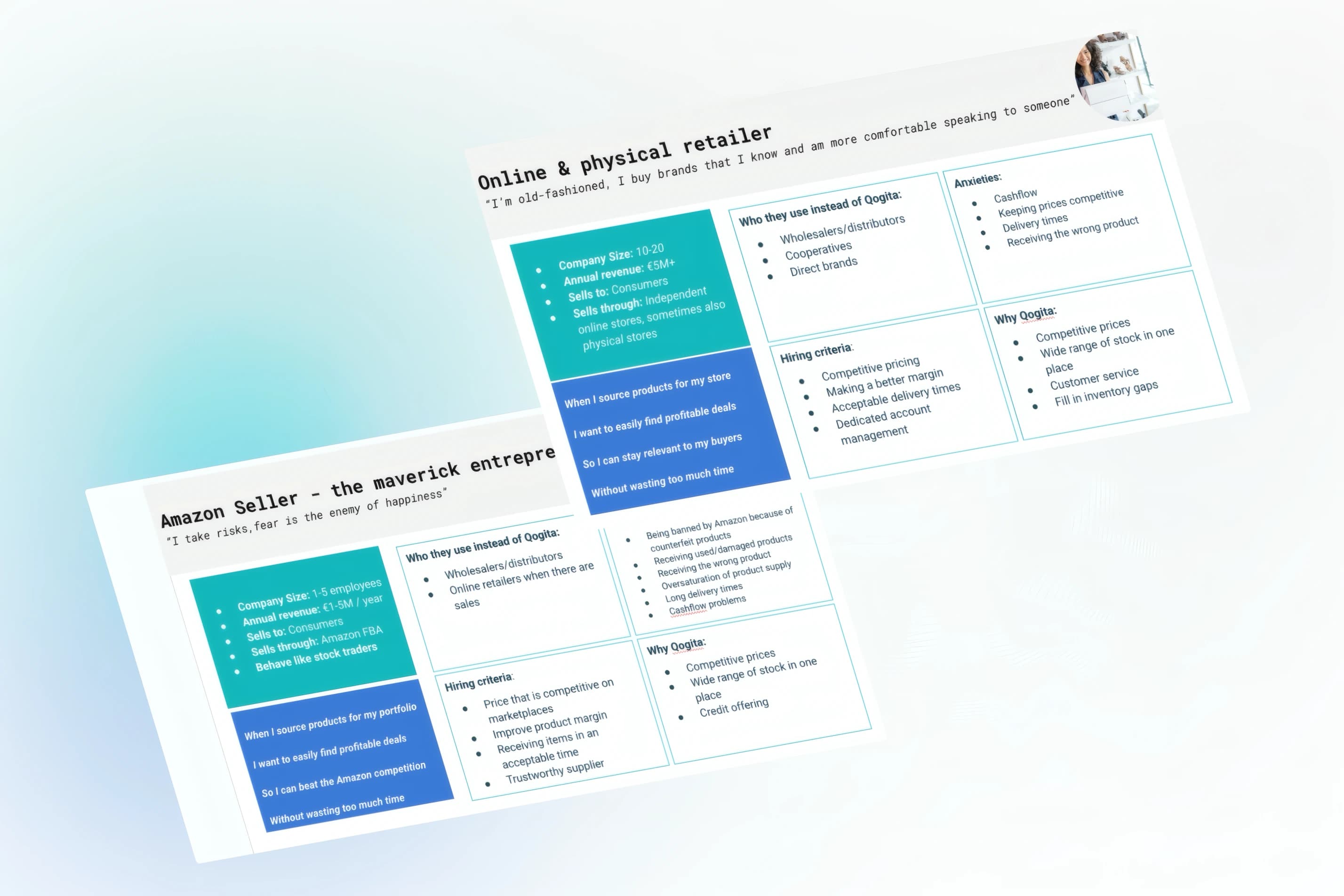
In many cases I don't understand optimization of the cart and it makes me frustrated. I think it's easier for me to do everything by myself manually.
One group needed the system to protect the work they'd invested; the other needed it to explain itself. Every feature had to serve both failure modes without getting in the way of either.
Three phased releases
I didn't start with a three-phase master plan — I started with a diagnosis: the optimizer was the problem, and buyers needed visibility and control. Each phase was scoped to ship value and answer the question that shaped the next, at about four to six months of weekly releases per phase.
Stabilize trust
Make angry buyers believe the cart wouldn't betray them. Learned: trust improved, but buyers still couldn't act on the allocation.
Make allocation actionable
Move from visibility to understanding and action. Learned: incremental fixes had a ceiling — the cart structure itself was wrong.
Restructure the cart
Group by supplier, expose MOV progress, open up inventory browsing. Learned: structural control is what actually unlocks buyers.
Phase 01
Stabilizing trust
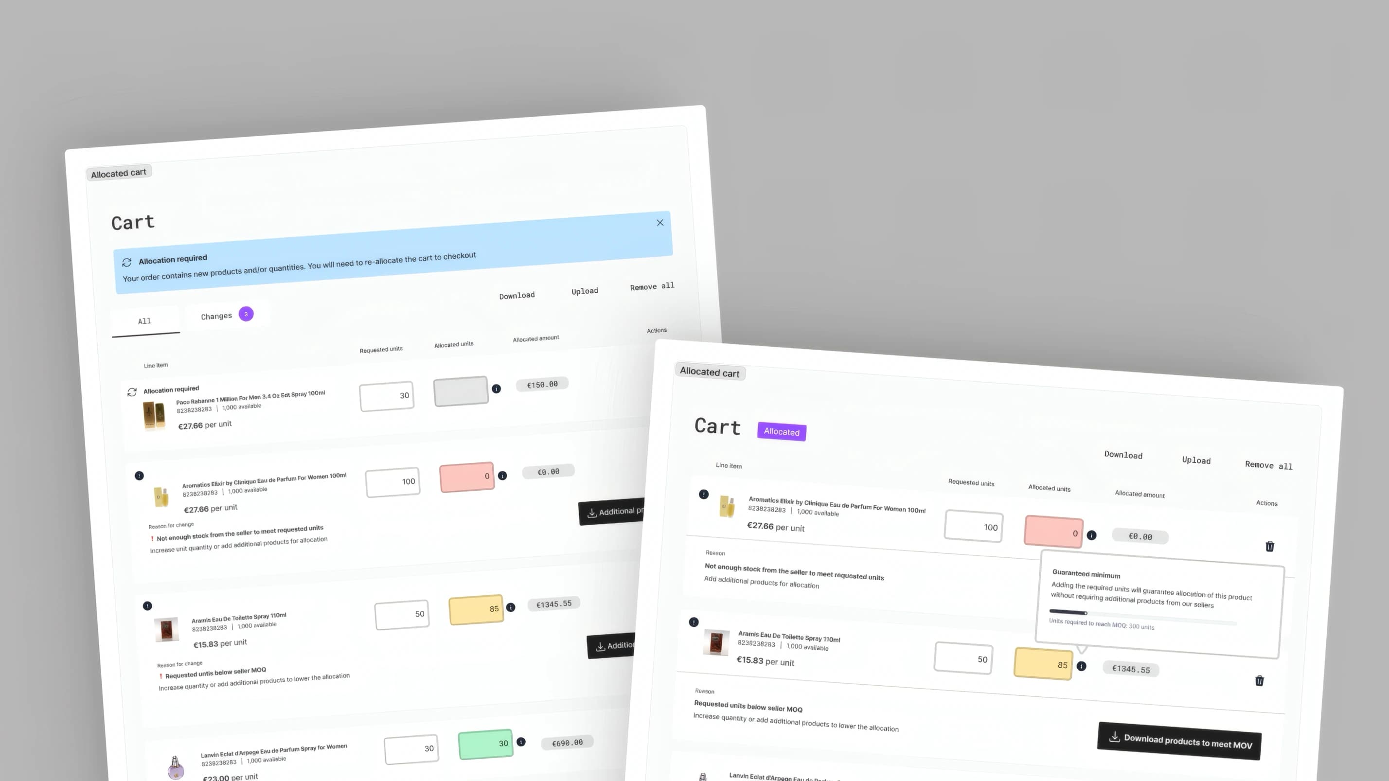
40–65% of cart items could change price or quantity after optimization, with no explanation and no way to undo. The first release made the cart stop betraying buyers.
- Fixed-pricing toggle that locks prices during allocation — adopted by ~40% of buyers, worth +10 points of checkout completion on its own
- Change highlighting on every adjusted line
- Non-destructive cart restoration, retiring the CSV workaround support teams had improvised
Phase 02
Making allocation actionable
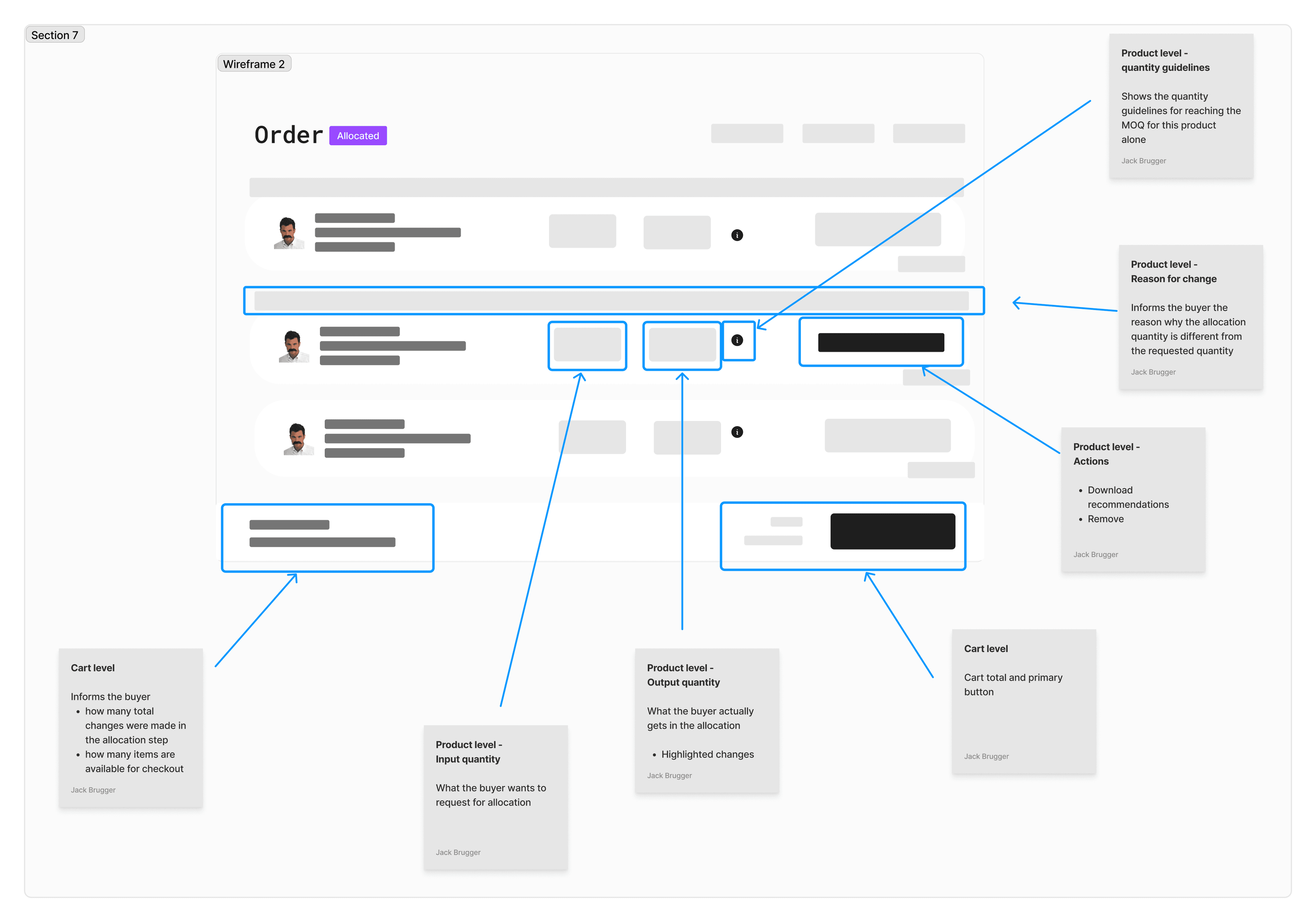
Buyers trusted the cart; now they needed to understand and act on it. The two-page 'original vs. optimized' flow collapsed into a single-page cart where buyers adjust and reallocate in real time without losing context.
- Single-page cart with real-time reallocation
- Key-account order value rose ~20%
- Reallocation attempts increased 20×
Explaining why the algorithm changed something helped key accounts but didn't scale — the real problem was architecture, not communication. That gap showed up sharply in who actually converted:
Order conversion by buyer recency data table
| Label | Value (%) |
|---|---|
| New buyers | 5% |
| Returning buyers | 17% |
If products are removed and recommendations suggest increasing quantities, I might delete the product instead. But the next time I optimize, it changes other quantities too. This back-and-forth wastes my time.
Phase 03
Redesigning the experience
Phases 1 and 2 proved incremental improvements had a ceiling. The structural redesign made the supplier the cart's primary grouping unit — instead of a flat list of 80 products where some mysteriously wouldn't check out, buyers saw six supplier groups, three ready, three needing more.
- Supplier-grouped cart, each group with its own MOV progress and subtotal
- Checkout readiness visible per supplier
- Mental model matched the system model — reported confusion halved
Making the supplier the unit of the cart is what turned an invisible constraint into an addressable one. Each group carries its own progress bar, its own state, and its own way out.
The old fix for a gap was a downloadable CSV of "buy more of this" suggestions. Fewer than half of buyers used it — not because it was hard to find, but because it told them to buy more of one product when most preferred to spread a purchase across several.
- 40.9%Used the CSV suggestions
- 59.1%Ignored them
Adoption of the old CSV MOV suggestions data table
| Part | Share (%) |
|---|---|
| Used the CSV suggestions | 40.9 |
| Ignored them | 59.1 |
Remove supplier
Drop an entire group if it isn't worth closing the gap.
Adjust quantities
Fine-tune per-product quantities within a group.
Browse supplier stocklist
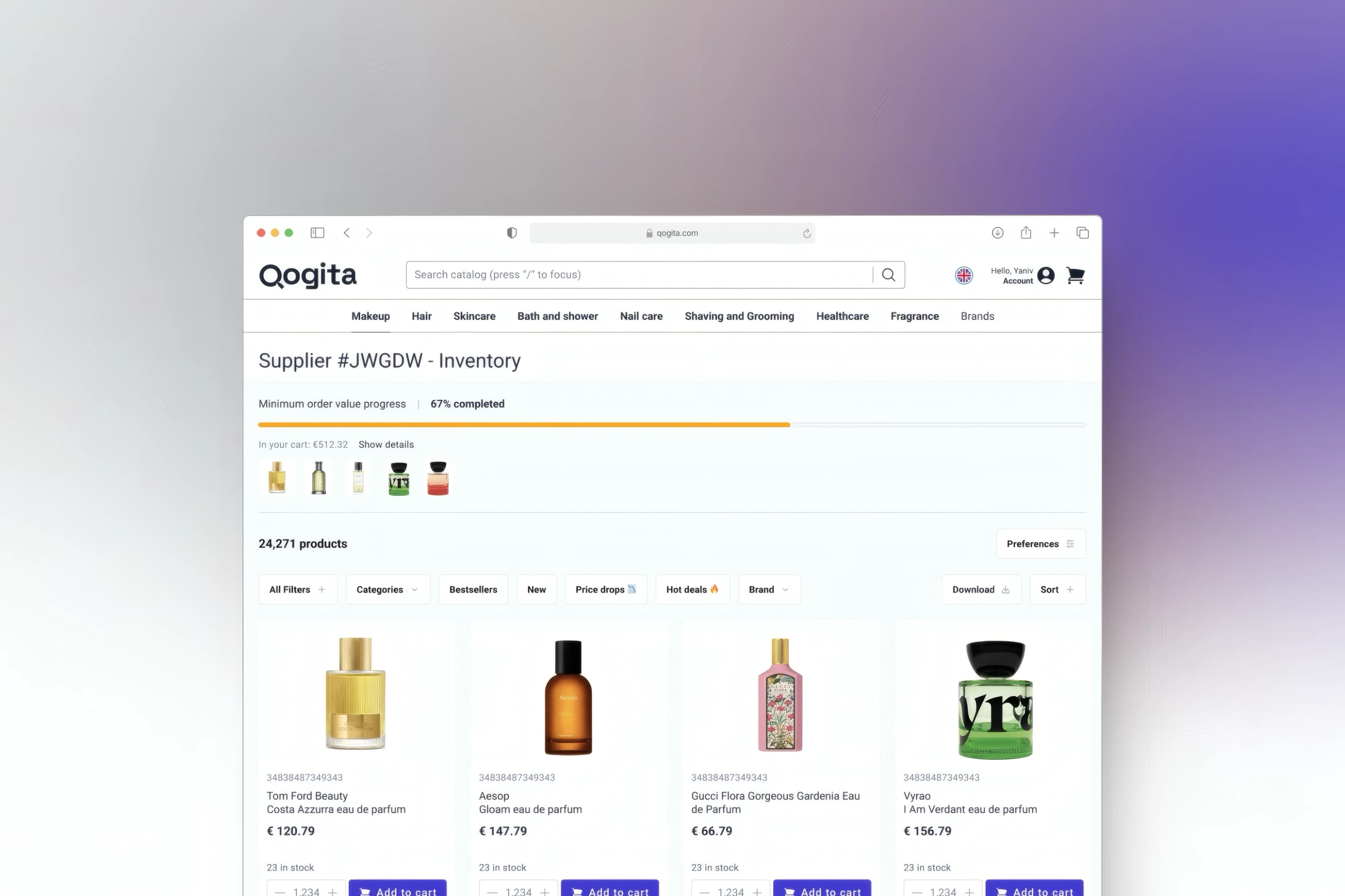
Full inventory browsing turns the MOV gap into a discovery moment — and a revenue driver.
Beyond the cart
Checkout was the centre of the work, but the same principle — show the buyer the state of the system and give them a lever — carried into the rest of the journey across 100+ releases. New buyers got a simple mobile path for a first test order; power users got price and quantity alerts that pulled them back when a product hit their target.
The result
Across the three phases, first-time checkout completion climbed off its 12% baseline as each release shipped.
First-time checkout completion across the three releases data table
| Point | Value (%) |
|---|---|
| Baseline | 12 |
| After Phase 1 | 22 |
| After Phase 3 | 30 |
The supplier-grouped cart I designed — grouping, MOV progress, inventory browsing — became the infrastructure Qogita's shift from wholesaler to open marketplace required. It's grown past €420M in GMV since that foundation was laid.
| Metric | Result |
|---|---|
| First-time checkout completion | 12% → 30% (+18 points) |
| Average monthly repeat orders | 1.0 → 2.2× |
| GMV during tenure | €31M |
| Reported buyer confusion | −50% |
| Releases shipped | 100+ |
| GMV since laying this foundation | €420M+ |
Design principles
- Make the invisible visible. Opaque automation breaks trust; visible automation builds it.
- Give users proportional control — three dimensions, three levers, not one composite button.
- Don't overwrite work users invested days in. Ever.
- Show users the shape of the algorithm, not just its output.
- Turn constraints into discovery moments. If a user has to add products, help them find ones worth adding.
- Users should learn the structure once. Don't change it at handoff points.