Infinitas Learning
- Client
- Infinitas
- Role
- Design System Specialist
- Timeline
- 2025
- Deliverables
- Token architecture, Component library, Design-system documentation
Infinitas builds learning software for classrooms. I joined the design-system team as a specialist to move the product off Pixel, the system it had grown up on, and onto Quipu — the platform design system we built to replace it.
I owned the token architecture: how tokens were structured, what they were allowed to be called, and what a name had to settle before a component could use it. Then I rebuilt the components against it, one at a time.
What we inherited
Pixel was assembled rather than designed. Most components wrapped MUI; a few came from other libraries; some had been drawn from scratch. That is a normal way for a product to reach its third year, and it is not a criticism of the people who built it — it ships features fast, and the bill arrives later.
The bill is a vocabulary problem. When a component wraps MUI, its props describe
MUI's ideas. variant distinguishes a filled chip from an outlined one, because
MUI's model of a chip is a box that is either filled or not. Nobody at Infinitas
was ever asking that question. They were asking whether a chip sat directly on
the page or nested inside another surface — which is what actually decides how it
should look. The prop that mattered did not exist, and the prop that existed was
answering a question nobody had.
Values had the same problem in the other direction. With no naming rule, a developer reaching for a colour picked whatever was closest, so intent lived in people's heads and drifted every time someone new joined.
Making the name carry the intent
The rule I set for Quipu was that a token's name has to settle where it belongs and what it is for, without anyone having to ask a designer. Values are defined in Token Studio and resolve down a chain, so a component never reaches past the tier above it.
- Tier 1Primitive
Raw values. Named for what they are, never for where they are used.
- blue/500
- #0095e1
- grey/900
- #111111
- Tier 2Semantic
Usage context, aliased from a primitive. Role, then intent, then state, then emphasis — in that order, always.
- color/background/interactive/supportive/defaultSubtle
- →blue/50#def1ff
- color/background/interactive/supportive/hoverSubtle
- →blue/100#bfe2fc
- color/background/interactive/neutral/pressed
- →grey/700#363636
- Tier 3Component
Scoped to a component, aliased from a semantic. One edit moves every variant that uses it.
- label/smEmphasis
- →fontFamily/body · fontSize/label/sm · fontWeight/labelEmphasis · lineHeight/label/sm · letterSpacing/label/sm
A composite: five type decisions applied as one token, so a label cannot be assembled two different ways in two different components.
Read the middle tier out loud and it says what it is:
color/background/interactive/supportive/hoverSubtle is a background, on an
interactive element, in the supportive intent, on hover, at the subtle emphasis.
There is exactly one place that token can go, and a developer picking it does not
need to know which blue it resolves to.
The part I am most pleased with is the spacing. A chip's padding is not one number — the side with an icon needs less than the side with text, or the shape reads as lopsided. Most systems handle that by nudging the component. Quipu names it, so the compensation is a decision the system records rather than something each designer rediscovers.
| Token | Value | What it settles |
|---|---|---|
| spacing/padding/edgetoicon/xs | 6 | Icon side of a small chip |
| spacing/padding/edgetotext/xs | 8 | Text side of the same chip |
| spacing/padding/edgetoicon/sm | 10 | Icon side of a medium chip |
| spacing/padding/edgetotext/sm | 12 | Text side of the same chip |
| icon/size/labelSm | 15 | Icon beside a 12px label |
| icon/size/labelMd | 17.5 | Icon beside a 14px label |
The icon sizes work the same way: an icon is sized against the label it sits
beside, not against a generic scale. 17.5 is not a number anyone would pick
from a t-shirt scale. It is the size that makes an icon look the same weight as
14px text, and having it in the system means it is right everywhere by default.
Rebuilding, component by component
Nothing was migrated. Every component was rebuilt against the new tokens, which is slower than re-skinning and the only way to actually leave the old system — a wrapper with new colours is still MUI's component, with MUI's props and MUI's assumptions.
Rebuilding also meant re-deciding the API. Chip came out with seven props, none
of which is variant:
Component
Choice Chip
- Placement
- SurfaceNested
- Size
- smmd
- State
- DefaultHoverActive
- Selected
- TrueFalse
- Disabled
- TrueFalse
- Avatar
- TrueFalse
- Leading icon
- TrueFalse
Variants drawn
84
Combinations
192
The gap between the two figures is the interesting one. A disabled chip has no hover. A chip cannot carry an avatar and a leading icon at once. Those combinations are not missing — they were declined, and declining them is most of what designing a component API is.
Search, and the two kinds of chip
Search is where a component library stops being a set of shapes. The field carries three jobs at once — a search affordance, a clear, and a submit — and only one of them is always available, so the clear is a state of the field rather than a control sitting beside it.
The correction is the decision I would defend hardest. Spektrm Fsik returns
results for Spektrum Fysik, and the system says so underneath the field, as
part of the result — not as a suggestion inside the input. That keeps the input
free of any state that depends on what the server thinks, which means the field
does not need an error variant, a suggestion variant, or a dropdown that has to
be dismissed.
The media types beside it are chips, and they are a different chip from the ones
in the filter panel. A filter chip has a selected state, shown as a leading
check so selection never rests on colour alone. An input chip does not — it is
removable instead. Deciding that is what stops a library from growing one chip
with a closable prop, a selectable prop, and an invalid combination of the
two.
The filter accordion
The panel shows one state through two components on purpose. The checkboxes inside a section are how you choose a filter; the chips at the top are how you undo one, without hunting for the section it came from. Neither is redundant — they answer different questions, and the second only exists because a long facet list makes the first unfindable.
The section header keeps its full width and its chevron whether it is open or
shut, so expanding is a change of state and never a change of layout.
Show more options caps a long facet so the section below it stays reachable.
Card
Card is the component that had to stay a contract rather than a layout: media,
overline, title, meta line, chips, actions. +2 is an overflow count, not a
truncated third chip, so a book in five classes and a book in one occupy the
same height. The favourite star sits outside the content flow, so a long title
can never push it somewhere else.
That contract is what the next section is about — the same six slots hold a teacher's worklist and a nine-year-old's homepage.
What it composes into
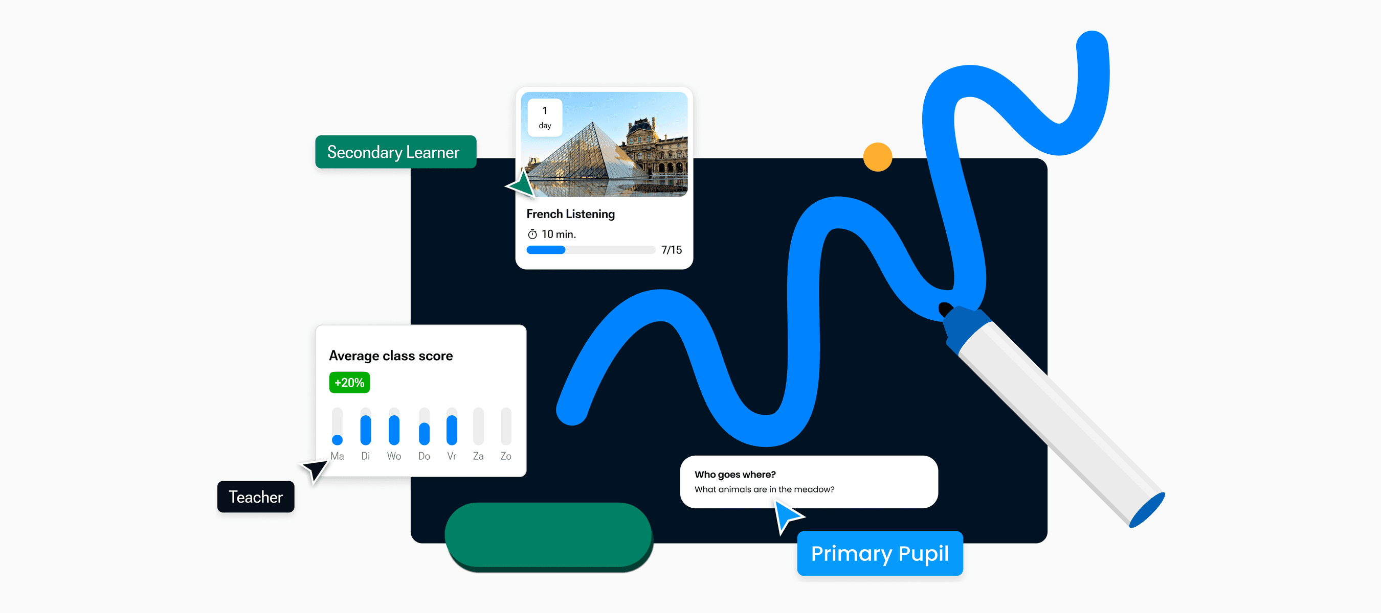
Quipu serves three audiences out of one library: teachers, secondary learners and primary pupils. They do not want the same product. A teacher wants density and a lot of it on screen at once; a nine-year-old wants one obvious thing to press.
A secondary learner gets the same vocabulary, loosened:
The cards are the card: media, overline chip, title, supporting line, progress. The nav is the nav. What changed is register — scale, roundness, weight, contrast — and register is exactly what a semantic tier is for. A product that needs to look this different from its sibling is the case that decides whether the middle tier was worth building, because the alternative is two libraries and two of every future fix.
Making it hold
A design system fails quietly. It ships, it looks complete, and then it drifts, because nothing records why anything is the way it is. So every Quipu component carries two things besides its variants: a documentation card stating what it is for and linking to its Storybook build, and a dated changelog. Every entry in the log names the change and the reasoning. Chip's runs from 9 May to 30 July 2025.
One entry reads: the closable chip had a Selected state of true, when it should be false — there is no selected state for an input chip, only a filter chip. Both of those chips are on the search page above: the removable ones under Selected filters, the selectable ones in the row of media types. The correction is small, and writing it down is the difference between a system that holds its shape and one that quietly accumulates exceptions. Six months later nobody has to reverse-engineer the intent from the file.
What this demonstrates
Token architecture
Structure, naming rules, and the discipline to hold them
Role, then intent, then state, then emphasis — defined in Token Studio and enforced by review rather than by hope.
Component API design
Props that describe the product, not the library underneath
Placement replaced variant because placement is the question the product was actually asking.
Migration under load
Rebuilt component by component, with nothing frozen
Each component left MUI on its own schedule, so the platform kept shipping throughout.
Governance
Documentation and a changelog on every component
The reasoning is recorded where the component lives, so intent survives the people who set it.