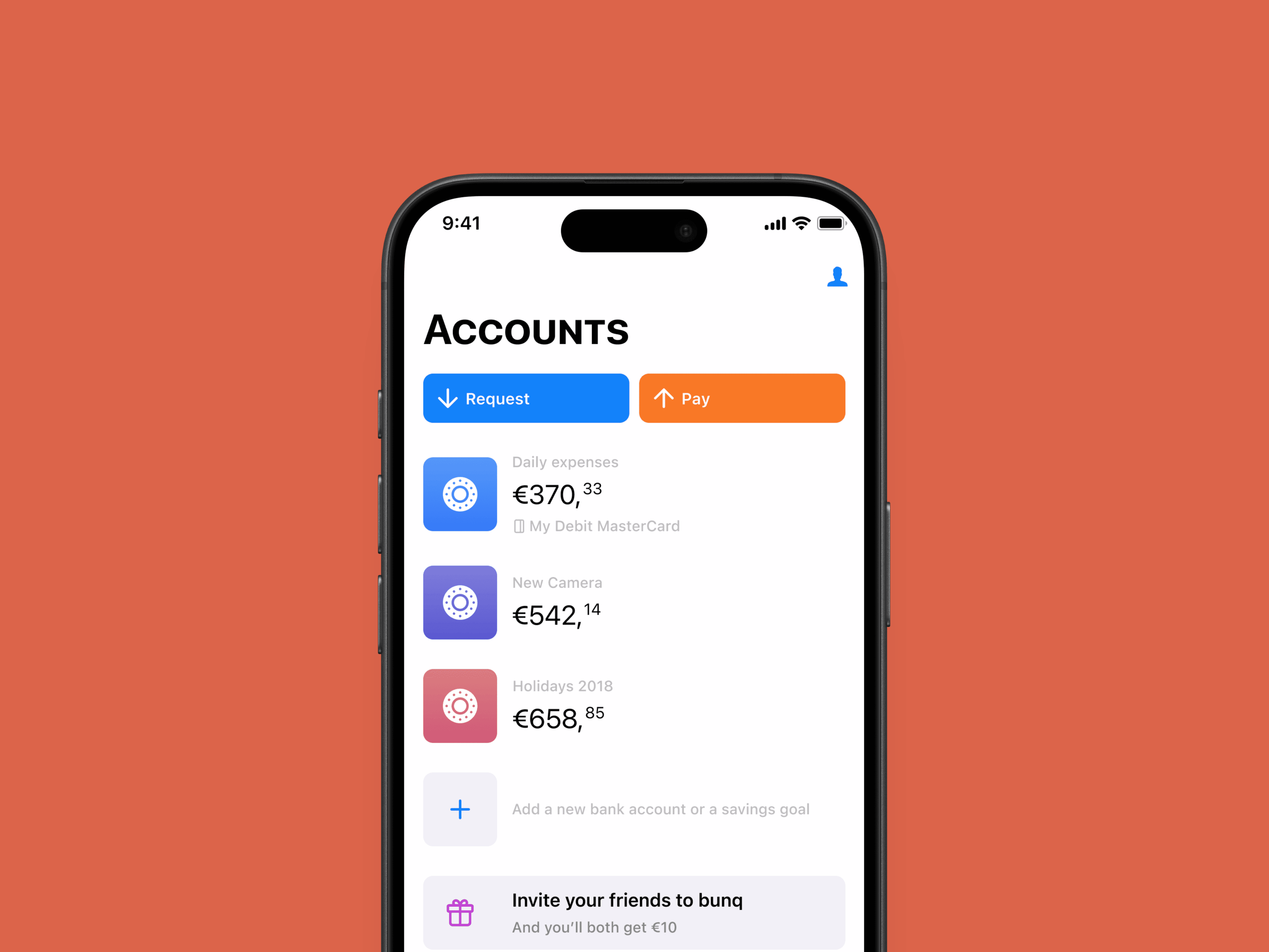
bunq
- Client
- bunq
- Role
- UX Growth Designer
- Timeline
- 2017–2019
- Deliverables
- Onboarding & activation design, A/B experimentation, iOS & Android collaboration
- Card activation
- +15%
- Funded accounts
- +19%
- 1-month retention
- 45→80%
- Experiments run
- 9+
The first €1 is everything
bunq is a European neobank positioned as "the bank of the free" — mobile-first, higher-priced, and unapologetically different. I joined the growth team as a UX designer working on acquisition, onboarding, and activation.
This project focused on one deceptively hard question, at the moment a new user had just been approved:
With money, trust is everything. A neobank doesn't win when someone signs up — it wins when they order the first card, top up, and make the first transaction. That first €1 into the account is the real conversion. Everything before it is a promise; everything after it is a habit.
- 01App downloadaccount creation
- 02Verificationaccount creation
- 03Order cardactivation
- 04Add balanceactivation
- 05First transactionactivation
- 06Daily useactive
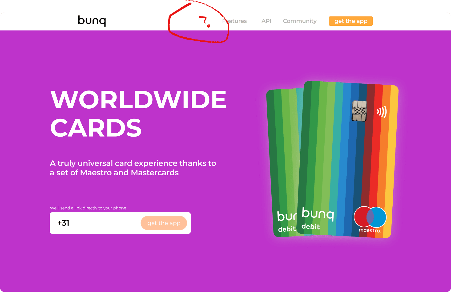
Playfulness eroded trust
A major onboarding update had shipped quickly, and the numbers underneath it told a quiet story. Digging through Mixpanel, Google Analytics, and the "bunq Together" community, four problems surfaced again and again:
Pricing
Nobody could tell what anything cost
There was no pricing page, so people couldn't tell what was free or how bunq compared to Rabobank, Revolut, or Monzo.
Features
Premium was a mystery box
It wasn't obvious what "Premium" actually included — or why it was worth paying for.
Permissions
Privacy prompts read as surveillance
Vague privacy and location requests appeared without explanation, at the moment trust mattered most.
Post-approval
Approved users had nowhere to go
The warm-welcome flow gave no clear next step, so newly approved users simply stalled.
bunq's very playful tone masked much of this. It was charming, but the charm was getting in the way of clarity — exactly where clarity mattered most.
- 40%Visited the pricing page first
- 60%Downloaded without seeing pricing
Landing-page visitors who went on to download the app data table
| Part | Share (%) |
|---|---|
| Visited the pricing page first | 40 |
| Downloaded without seeing pricing | 60 |
A data-driven process
The team's philosophy was to be obsessively data-driven: fail fast, validate quickly, double down on what works. The work moved through three phases.
Quantitative research
Mapped the funnel in Mixpanel and Adjust to pinpoint exactly where people dropped off.
Qualitative research
Roughly forty short interviews with people who hadn't signed up, tracing their emotions, hesitations, and confusion.
Experimentation
Nine lightweight, low-cost experiments across landing pages, app-store messaging, and in-app flows before scaling anything.
The interviews became a screen-by-screen journey map of the existing onboarding — what people felt, thought, and stumbled over from first open to approval.
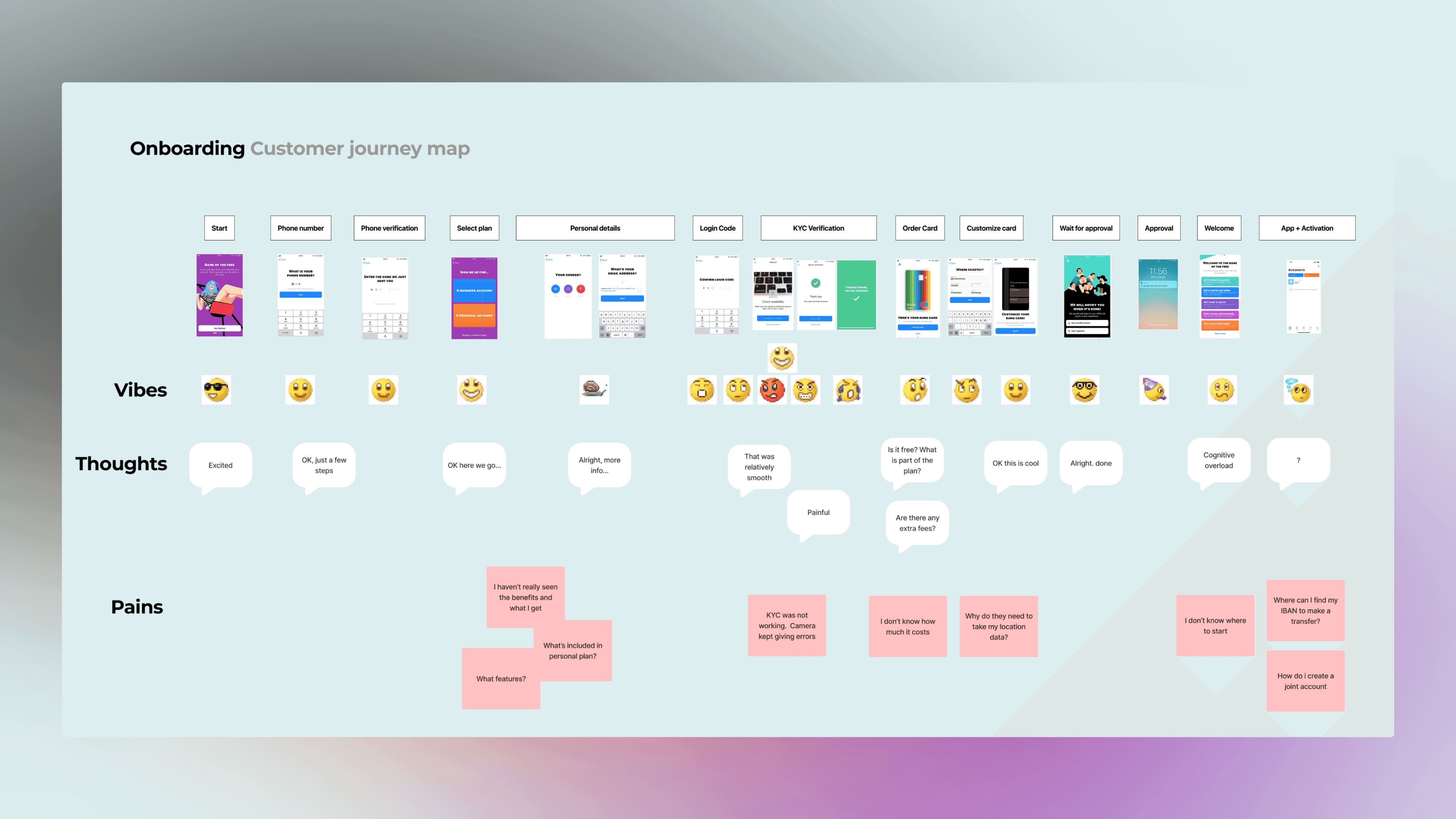
The friction, in users' words
The interviews turned abstract drop-off into concrete sentences — and three themes ran underneath them:
Cost ambiguity
“I didn't know the card was free. Do I have to pay shipping costs?”
People assumed ordering a card cost money — even on a free plan.
Permission anxiety
“Why do you need access to my location data?”
The location prompt read as tracking, not as card delivery and fraud protection.
Lost after approval
“I had a look around the app, but something came up and I forgot.”
The flow asked for sensitive information before showing any value, then offered no next step.
I annotated the existing flow screen by screen to pin each complaint to the exact moment it happened:
Card first, paperwork later
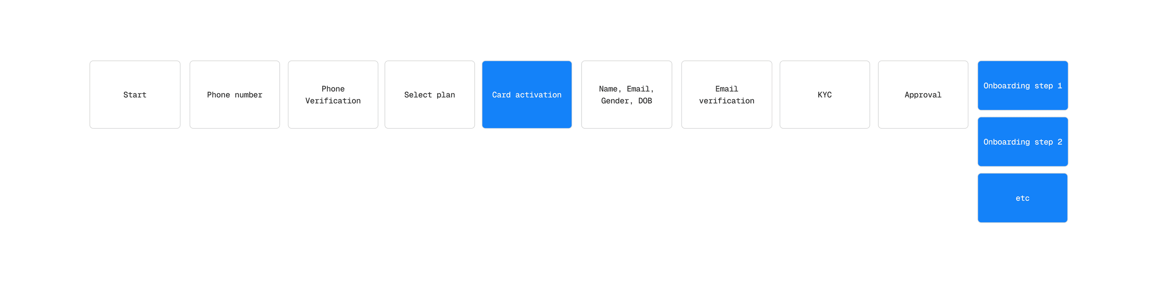
The flow itself compounded every one of those problems. The old onboarding asked for personal details and ran full KYC before ever showing the card — the one tangible thing people actually wanted. Adjusting the logic and combining steps produced a faster account creation flow with a simple rule at its core: show value before asking for sensitive information.
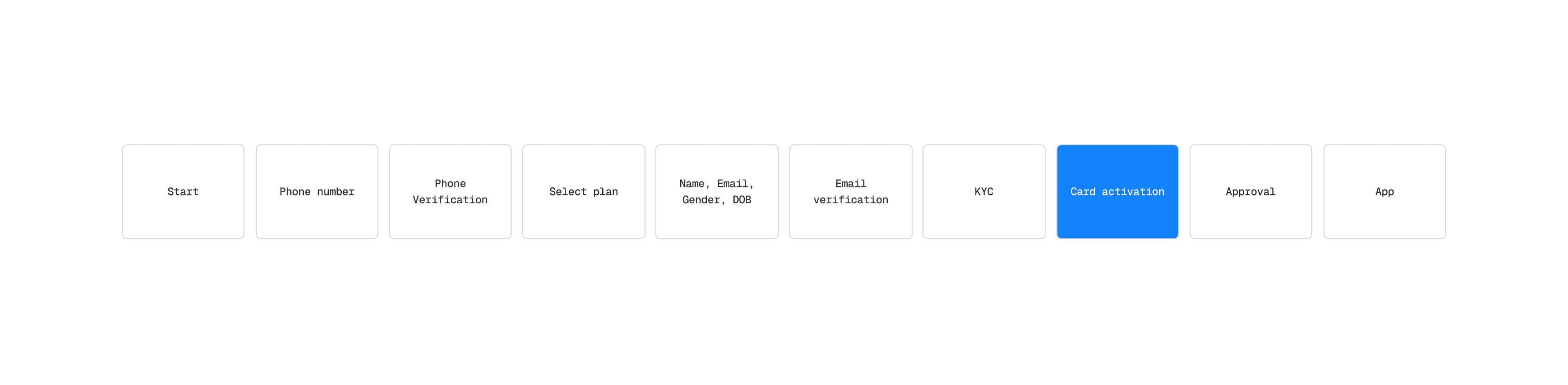
Four hypotheses, tested
H1 — Cost ambiguity. Show the exact checkout cost during in-app confirmation, with plain copy: your card is free, zero hidden fees. This alone drove a 3.5% increase in card orders among free-trial users.
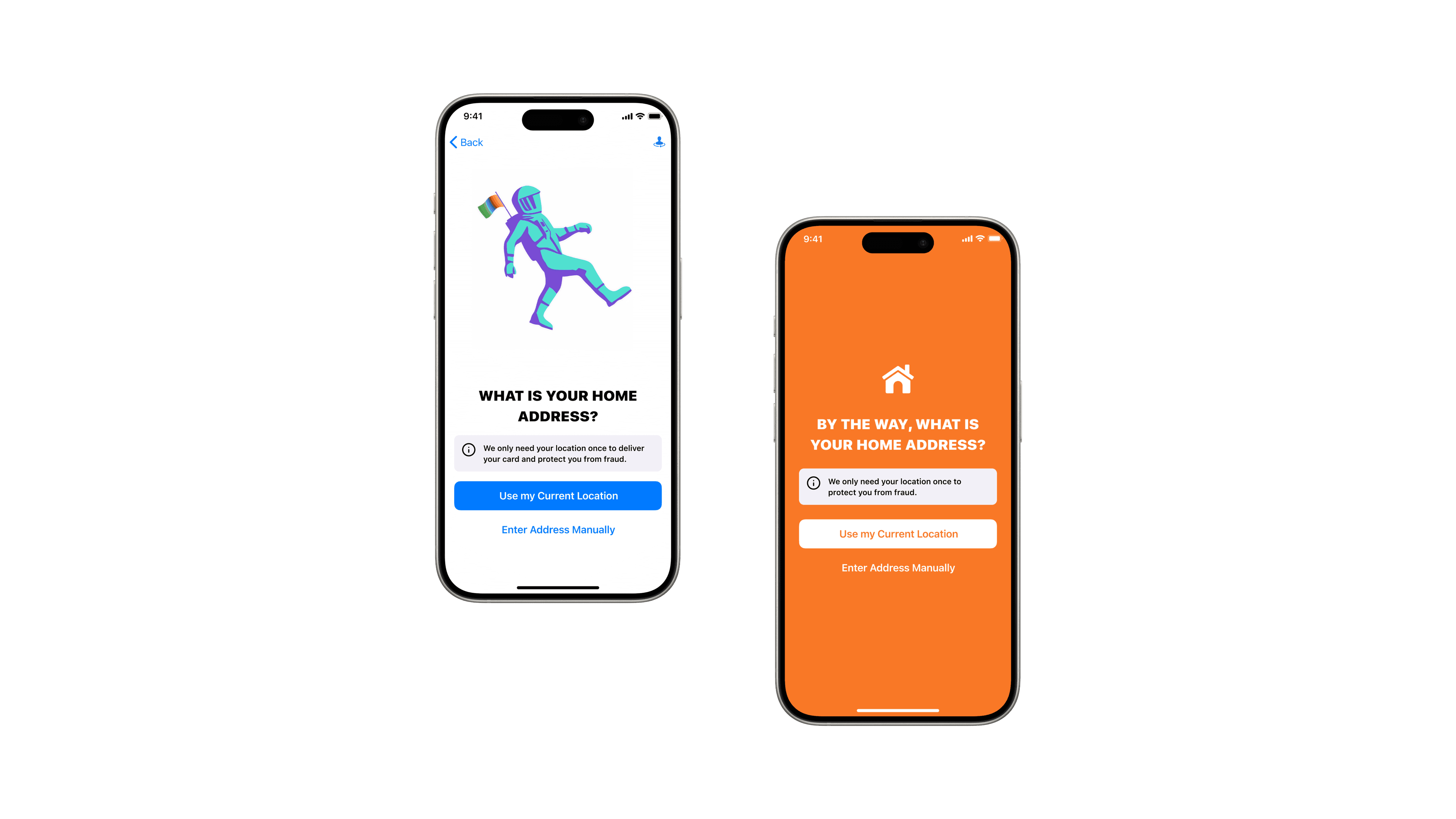
H2 — Location friction. Move the reason for the location request onto the screen itself, before the button — instead of burying it in a modal — so the ask reads as utility, not surveillance.
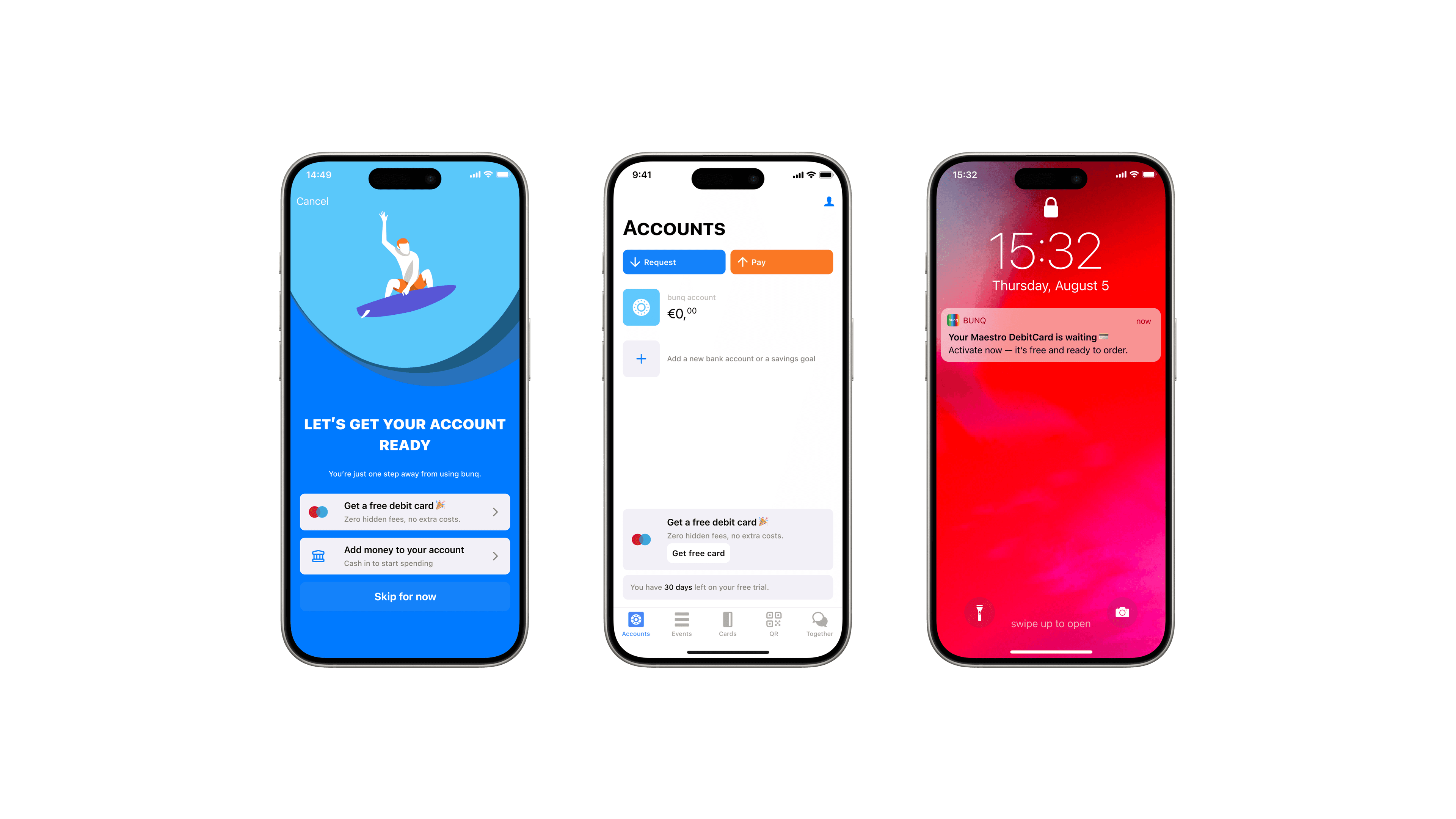
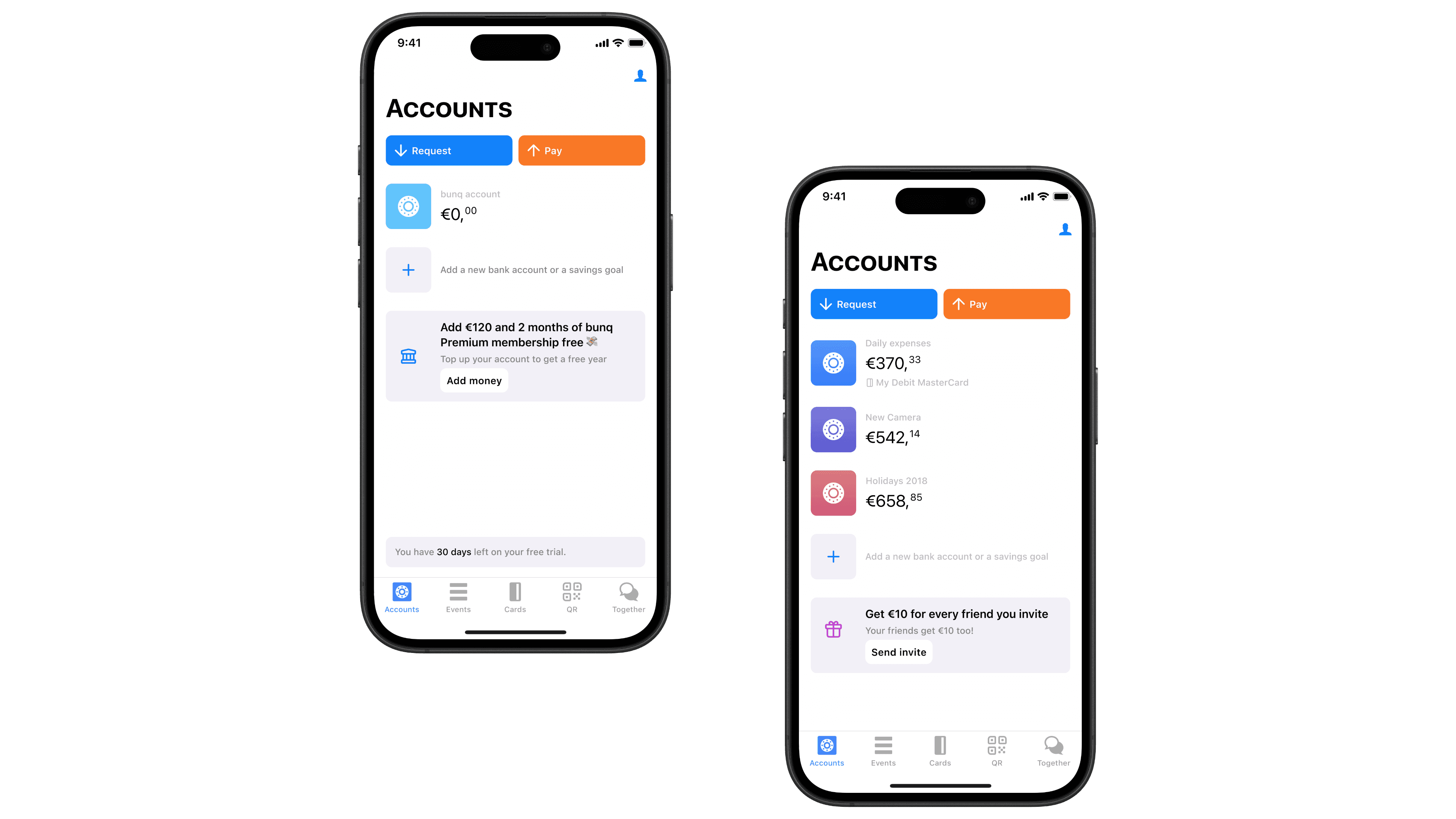
H3 — Lost after approval. Redesign the post-approval experience into sequenced banners ordered by activation goal — "You're just one step away from using bunq" — surfacing the next action (activate card, add money, explore features) right on the home screen so users could always resume where they left off.
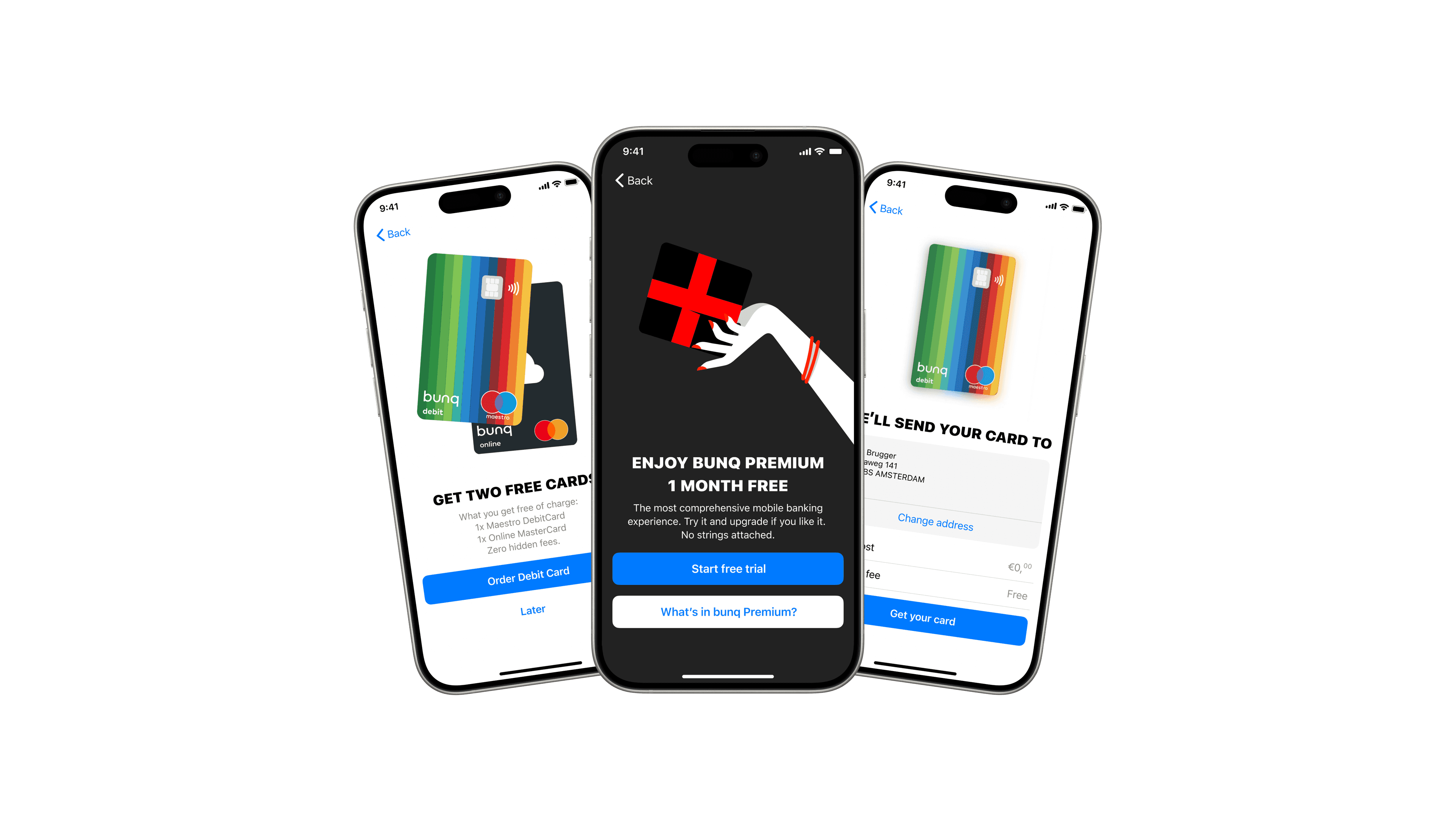
H4 — Debit card lacked utility. Research showed new signups wanted the online Mastercard more than the debit card, for immediate online use. I made the case to stakeholders to include the online Mastercard in the free trial — giving people a reason to use the app on day one. Repositioning it drove a 6% increase in funded accounts.
Sweetening the deal
Two low-cost incentives nudged the behaviors that mattered most. A deposit incentive ("deposit a year of bunq Premium and get two months free") pushed gently after card activation via a small dashboard banner — a light way to get money into the account and reward people for it. And a referral campaign ("earn €10 for each friend you invite — your friends get €10 too") was A/B tested across layouts and wording to lift invites.
Thirty tests on the way in
Alongside the in-app work, more than thirty creative tests ran on acquisition — ads to tailored landing pages, retargeted by persona and funnel position using Adjust events. Snapchat proved the cheapest channel at €6–8 per acquired user, against €12–19 on Google and Facebook. Some tests worked, some fell flat, but each one sharpened our read on which features actually moved people — insight that fed straight back into the onboarding itself.
Impact
Focused design work on the earliest moments of activation compounded into retention and long-term value:
- 15% improvement in card activation
- 19% increase in accounts with funding
- 56% increase in salary deposits — users treating bunq as their main bank
One-month retention after the free trial data table
| Label | Value (%) |
|---|---|
| Before | 45% |
| After | 80% |
These sat alongside the core product team's work on Mastercards, Apple Pay, and more. Today bunq is profitable, with over twelve million customers worldwide.
What I learned
- Growth funnels are circular habit structures, not linear paths. Activation feeds retention, retention feeds referral, referral feeds acquisition.
- Small details move real numbers. A missing "free" cost 3.5% of card orders.
- Clarity about pricing and features builds trust — especially when you're asking someone to switch banks.
- Show value before asking for anything — attention, personal details, or money.