bunq

Growth hacking 3k to 100K new personal users by improving onboarding and accelerating activation.

Role — UX Growth Hacker
Overview
At bunq, I led acquisition, onboarding, and activation design during a 10x growth phase, working with product and engineering to improve the first‑time journey.

Prototype

Key results
15% increase in card activations.
19% more accounts with funding.
60% 2‑month retention after trial (by early 2019).
56% more customers using bunq as their primary bank (salary deposits).
Goals
Reduce activation drop-off
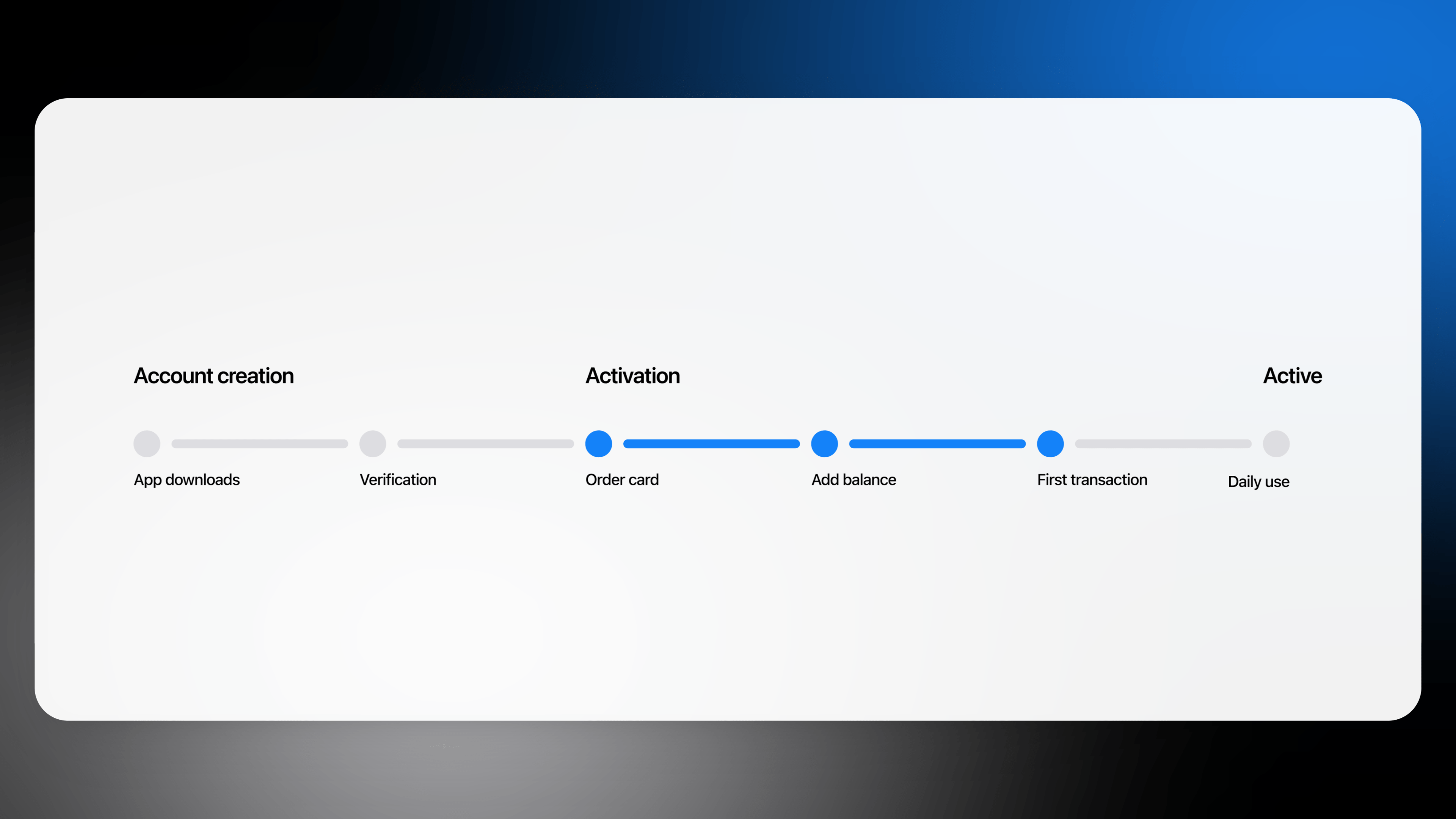
Activation is when users form key habits like funding their account or ordering a card. These steps had the most drop-offs, causing many to leave before staying engaged.
Increase completion rate of critical actions early on
Our focus was on making the first 7 days stickier. Daily activity in the first week strongly correlated with retention.
Increase free trial to premium conversions and 2 month retention
Our goal was to turn trial users into paying customers. Those who funded their account and used their card early were more likely to stay, proving early habits drive retention.
Approach
Quantitative research
Analyzed user behavior through event tracking, quick tests, and community feedback
Qualitative research
Ran 30+ interviews to understand motivations and pain points
Experimentation
Tested UX improvements through over 9 low-cost experiments before scaling
Discovery
What was the core problem? Bunq's playfulness outplayed itself. The onboarding was unclear. Too much useful information was hidden, and the overly playful tone left users guessing how features worked or what they were signing up for.
How much does it cost?
What are the different membership options?
What is included in the free trial?
There wasn’t even a pricing page 😲
Landing page experiment
A quick experiment using Google Optimize showed that users were just as interested in learning more as they were in downloading the app. We saw a clear increase in unique clicks on 'learn more' links, confirming strong engagement with the content.
40% of all visitors who downloaded the app from this session visited the pricing page.
User interviews
We followed the first experiment with 30+ interviews with non‑users, then turned their feedback into a journey map showing where people got confused, what they felt, and the main pain points.
Pain points
We found three issues: unclear card pricing led users to assume hidden fees, location sharing during card ordering felt misleading even though it supported fraud detection, and after approval users lacked guidance on next steps or how to activate their account.
Card cost ambiguity and lack of utility
Users weren’t sure if the card was free, which made them hesitant to continue. Many expected a Mastercard they could use right away, but instead saw a basic debit card with unclear value.
How much does it cost?
What are the different membership options?
What is included in my membership?
What is a debit card?
Do you have MasterCard?
Location sharing pushed users away
The second step asked for the user's address to deliver their card, with an option to share their location. But when selected, the prompt mentioned it was for fraud detection - causing some users to feel suspicious.
Do I have to pay shipping costs?
Why do you need access to my location data?
What is included in the free trial?
Without direction users forget quickly
After approval, users were dropped into the app with no clear direction. The welcome screen was just a list of options, with the most options being below the fold. There were no prompts to guide them through key actions.
Where can I find my IBAN?
I had a look around the app, but  something came up and forgot
Solution
Alongside these experiments, we looked at ways to improve parts of the onboarding and activation flow. Adjusting logic and combining certain steps resulted in faster account creation and an onboarding sequence with logic.
Placing card activation before KYC
We believed that if we showed users the value of bunq upfront, before asking for personal details, they’d be more likely to stick around and complete signup.
Old flow
New flow
Delivery
We released a series of updates that were tested with low-cost experiments before scaling out to full production.
The full experience
Card cost ambiguity and utility
We repositioned the online MasterCard for free trial users. This gave immediate utility to use the app. Secondly, we reduced ambiguity around card pricing, which led to a +6% increase in funded accounts - a key revenue moment.
Location sharing friction
Clear up loose ends on data. Be more up-front about what bunq uses with location data.
Users felt lost after approval
Redesigned the flow to include sequenced banners in order of logical activation goals.
Signup and retargeting experiments
I also helped run acquisition experiments across Snapchat, Google, Facebook, and other channels, alongside a technical paid specialist. We set up ad‑to‑landing and retargeting campaigns for tested cohorts, defined from detailed Adjust event data.
Cost of acquisition results
€6-8 CAC (Snapchat)
€12-19 CAC (Google, FB, Others)
Something extra to seal the deal.
We introduced two simple incentives to drive funding and referrals. After activation, a banner offered 2 free months of Premium for a €120 top‑up, and we A/B‑tested clearer referral copy and layouts.
Takeaways
Growth funnels are living systems. They should be conceived as circular habit forming structures, not linear paths.
The devil is in the details. Small things can make a big impact on performance.
Be clear and concise about features and pricing. Misleading erodes trust.
Don’t just shout at customers about how great you are.  Grab them by the hand and show them.
A smooth path alongside a strong tech stack is what wins.

More Case Studies

Want to work together?
Let's collaborate.