A white computer illustrationA black computer illustration
downloading files...

Blockport

CRYPTO EXCHANGE

Redesigning the transaction flow and features for a social trading CEX based on a hybrid-decentralized architecture.

Overview
Role — Product Designer
UX Research
Product Design
Product Strategy
Blockport, later acquired by BUX, was one of the first global crypto trading platforms. It made it easy and affordable to invest in digital currencies, with fees starting at €0. It lets anyone buy and sell crypto, no matter their experience or budget.
I joined as a freelance product designer to improve UX and explore social trading features for lightweights.
Key results
Increased transaction conversion among low-volume depositors
Over 3k users actively using copy feature
12x increase in profile visits for key traders
2× increase in non-major coins following design updates
Buy, Sell, Swap
For a crypto exchange, success means getting users to complete their first trade. However, the transactional experience hindered that goal due to several issues.
Pains
Initial coin deposits were low amongst 30-day signups
Buying and selling transaction flow was overloaded and difficult for newcomers
Imbalance between interface engagement and practical guidance
New users don't understand the difference between swapping on exchange and buying crypto
New users lack a simple, structured flow
When supporting both NPCs and advanced traders, we have to be careful of the UI supporting neither.
What’s the difference between 'Buy and Sell' and 'Exchange'?
Where do I make a deposit
Approximately? How much will I actually get?
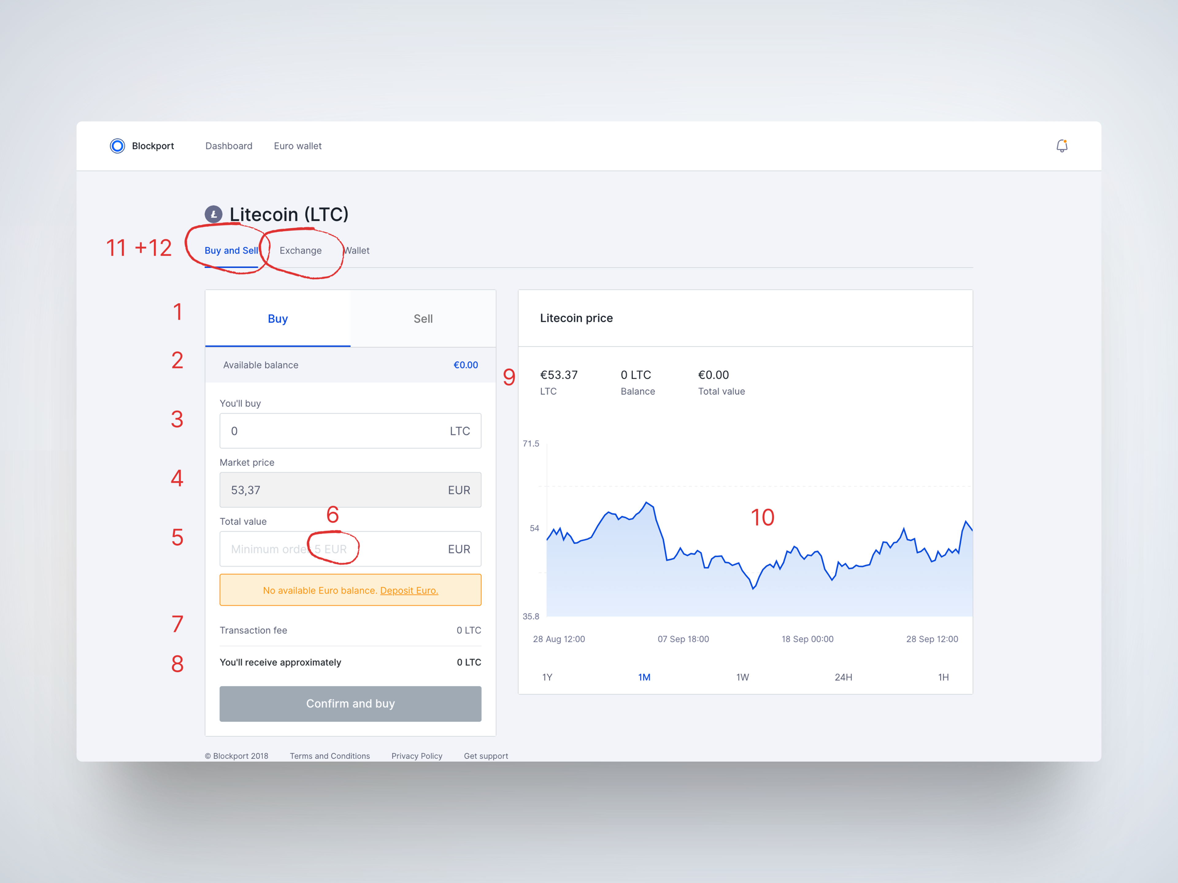
12 different things competing for the same thing. The interface was overloaded with information and confusing without clear call to action
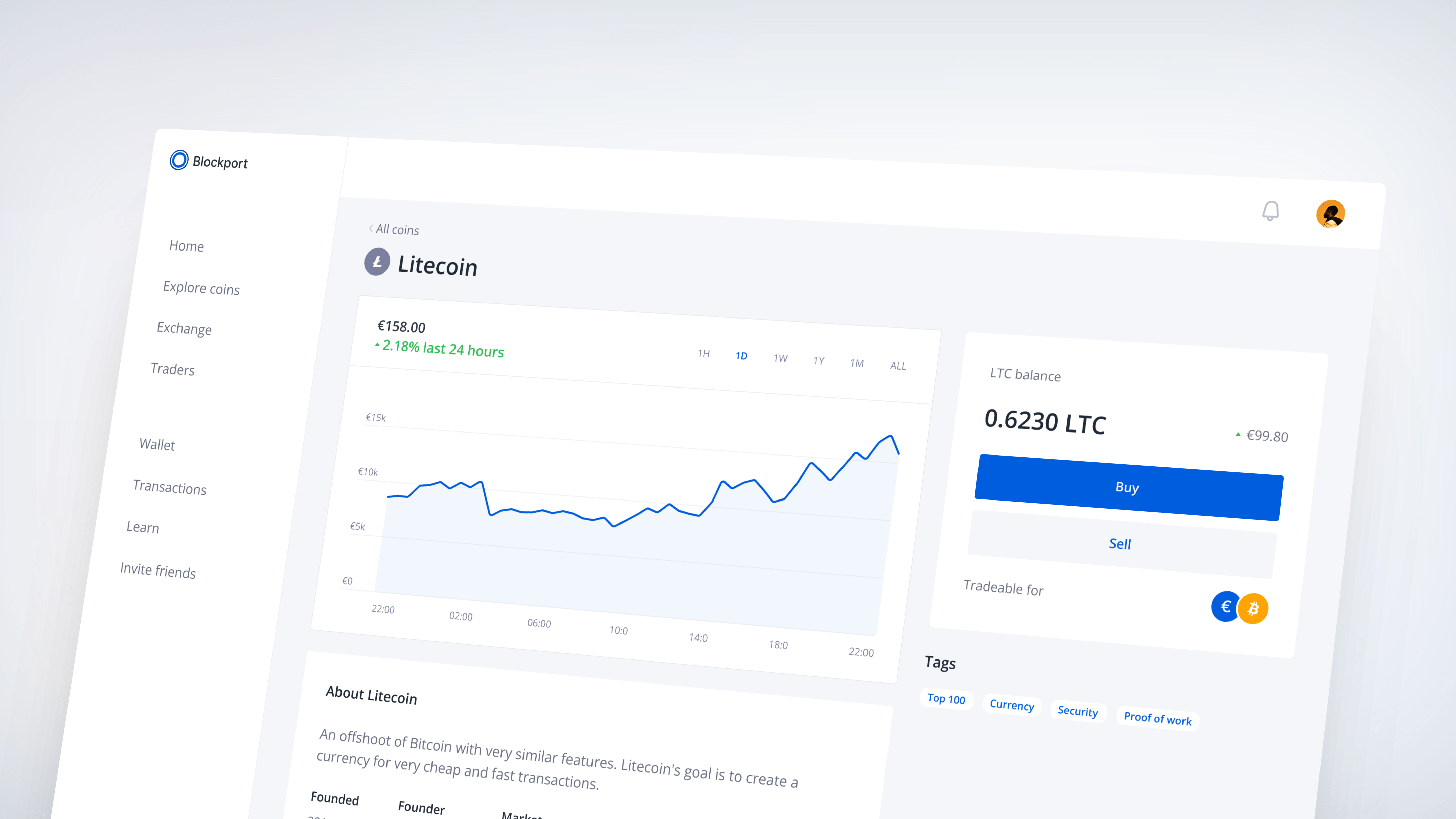
Solution for NPCs: trade directly from the coin page
I simplified navigation by separating the flow for two users. Beginners will go through the coin page flow, whereas advanced users can buy directly from the exchange.

This makes it significantly more accessible for first-time users, while still giving advanced users access to more powerful tools.
Step 1 - select whether you want to buy or sell
Step 2 - enter the euro or coin amount and buy
Solution for Degen & Advanced: buy, sell, swap from exchange page
Advanced users can purchase crypto with fiat on the Spot tab or quickly swap asset pairs on the Exchange tab. These pages are separated to provide guardrails for less experienced users, who often don’t realize that some tokens can’t be bought directly with fiat and are only tradable against assets like Bitcoin.
Spot - users can buy or sell coins available in fiat currencies
Exchange - users can quickly swap token pairs
Another challenge:  all currencies have a BTC pair, but not all have a EUR pair. You don't want to find out when trading.
The simplified UI includes smarter form logic and better information hierarchy.
Splitting the flow into 2 steps for coin pages provides a simple structured flow for those in discovery mode.
Iterating on multiple variants helps achieve clarity over simple logic.
Social Trading
Motivating Users.  What Should I  Buy?
For many newcomers, the biggest blocker isn’t how to trade — it’s what to trade. Without guidance, they feel overwhelmed or hesitant to act. The default experience was passive, with little support in discovering interesting or relevant coins.
User needs
Quantitative signals
Qualitative context (what the coin is, what it does)
Social proof (how many others are trading it, community sentiment)
Ideating solutions for the social trading experience.
I introduced a Coin Browser designed to assist new users explore, learn, and feel confident taking their next step.
Coin browser. Users can explore popular or trending crypto.
Additionally, users can browse traders and filter based on period of activity, open coin positions, number of copiers and more.
Trader browser.
Users can explore each trader’s ROI, ranking, trading history, and strategy — or copy their activity directly.
Trader details
Onboarding
How might we improve activation for a CEX? I gathered community feedback and analytics data to identify opportunities.
Pains
Users face radical UI changes as they progress, forcing them to reorient themselves at each step
The onboarding flow focuses on isolated next steps without presenting a clear, motivating end goal
Steps in the process feel mechanical or procedural, rather than purposeful
Users must learn new UI patterns at every stage, which adds friction and confusion
Challenge: A disjointed onboarding will always fail to drive early success
This results in higher drop-off rates, lower activation, and users failing to reach the core value of the product: making their first trade.
Solution: A Goal-Oriented, Frictionless Onboarding Path
I redesigned onboarding around a core principle: make users successful by getting them to value quickly and clearly. Our improvements focused on five key heuristics:
Heuristics
Show users the full path to trading.
Progress indicators build momentum.
The interface evolves gradually so users learn it once.
Communicate value every step of the way
Only ask for what’s needed. Critical actions only — no filler.
Step 1 - Enter personal details
Step 2 - Enter your address
Step 3 - verify your identity
Step 4 - deposit money to your account and buy crypto. Onboarding pushed the user into its first 2 key activation steps: depositing money and making the first transaction

/other cases

Let's collaborate.